
HOME > Company Introduction > CI Introduction

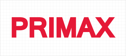

It represents the company with integrity that seeks global
presence based on superior quality and customer confidence of Primax

The powerful and energetic red color symbolizes passion for
technology and work and relentless spirit of challenge toward a global leader.


The color system plays an important role as a means that differentiates Primax from its competitors in delivering the corporate image as it is widely used in various media and thus a precise color expression, brightness and chroma must be maintained.
As a main representative color of Primax, it is used in wordmark and applications. Since color expression is subject to change according to media environment, an optimal color state based on pantone color should be properly maintained.


The most optimal background color for Primax Signature is white. When it comes to the relationship with the background color, clarity must be maintained in its best condition. You may adjust the background color depending on the media circumstances.
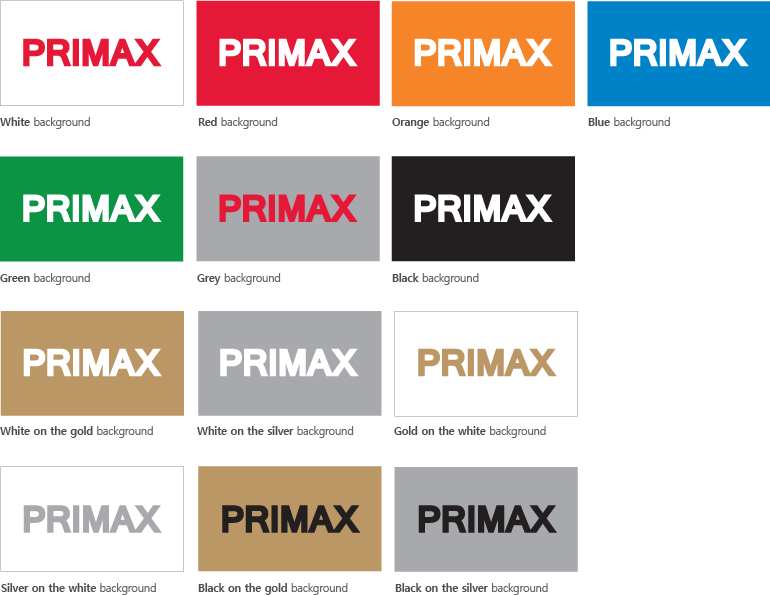

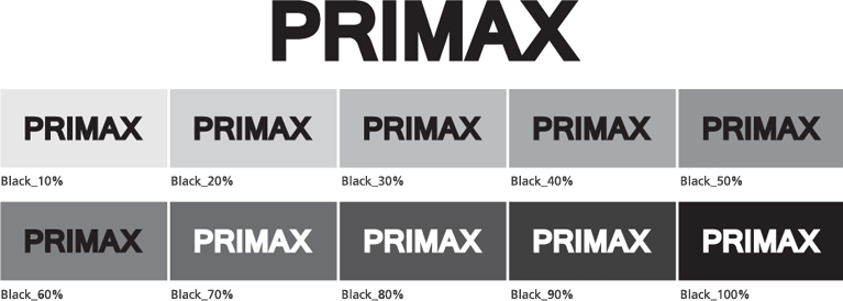
A proper utilization of watermark colors is critical in delivering the message of images as intended. Therefore, it is important to use correctly matching colors in consideration of the background and other factors, otherwise, the image itself and its representation may be severely compromised. The colors presented here describe the guideline on the use of black color and should be used in accordance with the guideline presented below.

The watermark must retain a minimum amount of its own independent space in its target media to maintain its appeal and attractiveness.
Extra attention is needed to prevent any graphical elements from intruding such retained space. The presented example is a guideline on minimum space to maintain the independent space, which is applicable to online banners and billboards. Resizing the image must be conducted in a direct proportion.


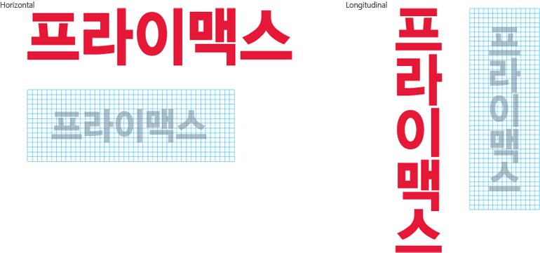
The logo type used as a means of communication to express Primax is designed in consideration of harmony with the corporate vision.
The font is also designed to best represent the corporate image of Primax with primary focus on the scale feel and clarity.

The logo type used as a means of communication to express Primax is designed in consideration of harmony with the corporate vision.
The font is also designed to best represent the corporate image of Primax with primary focus on the scale feel and clarity.


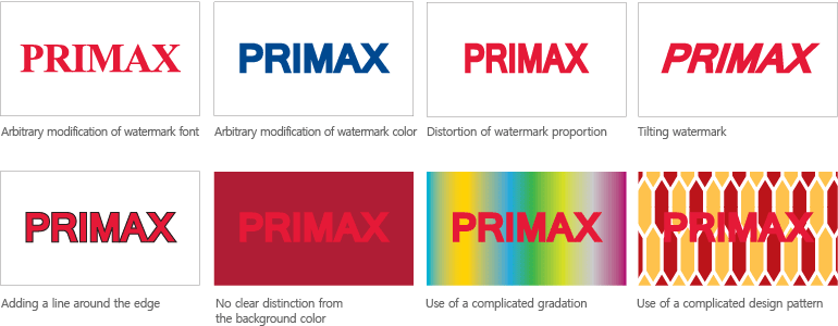
Any modification, alteration or deformation that is not in compliance with signature guidelines is banned as it may taint the image of Primax and cause identity confusion. The examples presented here may not only reduce identifiability of logos but also cause confusion.
